
iHerb
Responsive e-commerce website design.
iHerb.com is an online retailer specializing in natural products including vitamins, supplements, herbs, beauty products, groceries, and more. It offers a wide range of health and wellness products, serving customers globally. The website provides a convenient platform for users to purchase a variety of natural and organic items, with a focus on promoting healthy living and holistic well-being.
This project involved a holistic overhaul of iHerb's e-commerce platform, aiming to elevate user engagement, aesthetics, and functionality.
Summary
Roles: Researcher, UX Designer, UI Designer
Tools: Figma
Timeline: 5 months
Challenge
iHerb.com needed to enhance user engagement, aesthetics, and functionality on its e-commerce platform to cater to its global customer base and promote its wide range of health and wellness products effectively.
Solution
Through a comprehensive redesign, the project focused on revamping the user experience, interface design, and overall functionality of iHerb's website, providing users with a seamless and visually appealing platform to explore and purchase natural and organic items.
Design Process


User Needs
Users of iHerb.com need a user-friendly interface that allows easy navigation and search functionalities to find products quickly. They also require detailed product information, including ingredients and reviews, to make informed purchasing decisions. Additionally, users appreciate secure and convenient payment options, reliable and international shipping, and responsive customer support to ensure a smooth shopping experience.
Competitive
Research
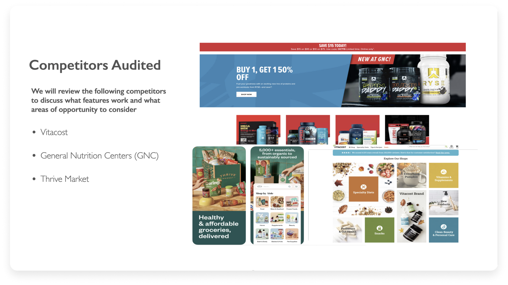
During the initial research phase, I looked at three direct competitors of iHerb: General Nutrition Centers (GNC), Vitacost and Thrive Market. The focus was on their website's architecture and arrangement, encompassing design elements, color schemes, utilization of visuals, and the holistic user journey.
What did I find?
Thrive Market is a one-stop-shop that offers a low membership fee for access to exclusive pricing with a price match guarantee.
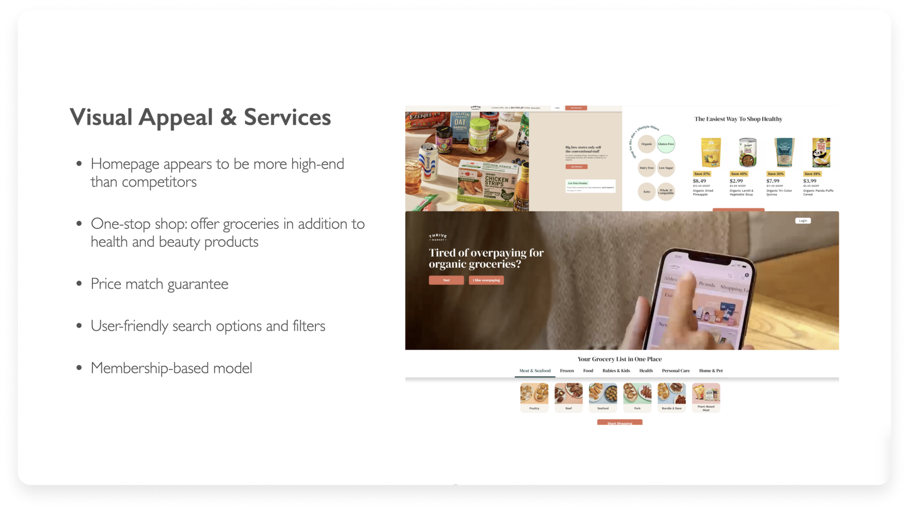
Vitacost & Thrive Market seem to have a more visually appealing and organized layout and color palette
Focus on improved search functions and easy navigation for users
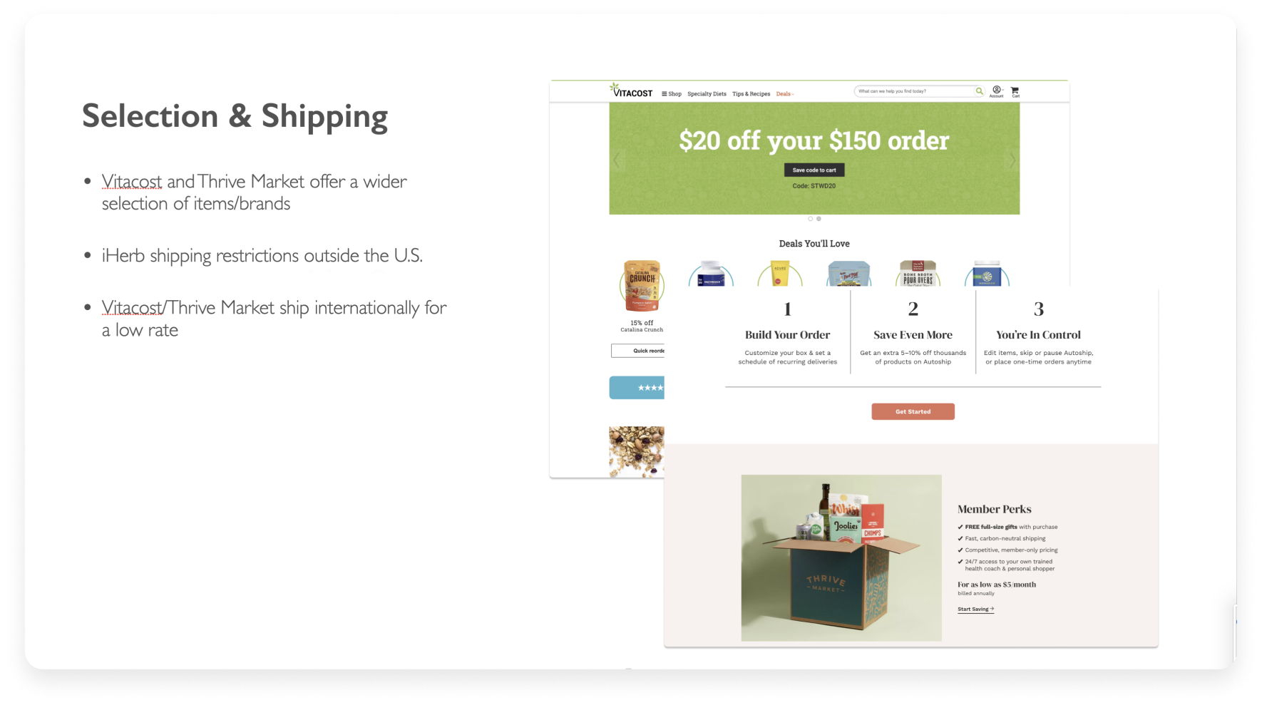
Less restrictions when it comes to shipping outside certain states or outside of the United States
An overall broader selection of items and brand names


Quantitative
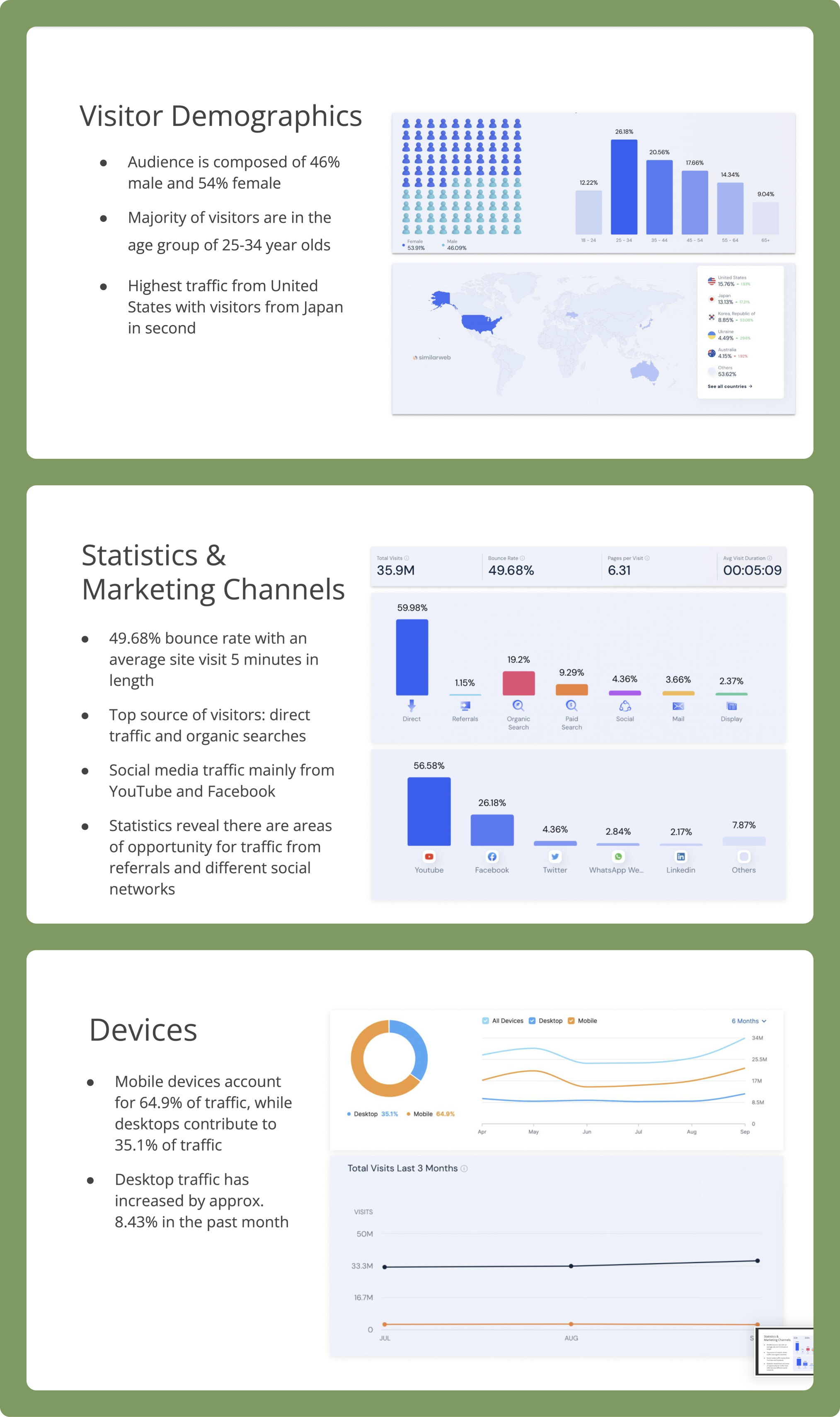
Research was comprised of observing the primary performance metrics of iHerb's website including visitor demographics, marketing channels, and types of devices used to access the website. This information was used to identify potential challenges and brainstorm actionable recommendations.
What did I find?
Majority of visitors are female (54%) between the ages of 25-34 years of age.
A nearly 50% bounce rate with an average of five minutes spent on the site.
Recommendation: Enhance website navigability by streamlining and simplifying the user journey. Craft distinct sections for easy access, accompanied by captivating visuals and engaging content to intrigue and guide users effectively
Mobile devices account for nearly 65% of the traffic. I recommend the redesign focuses heavily on a user-friendly, mobile responsive design.
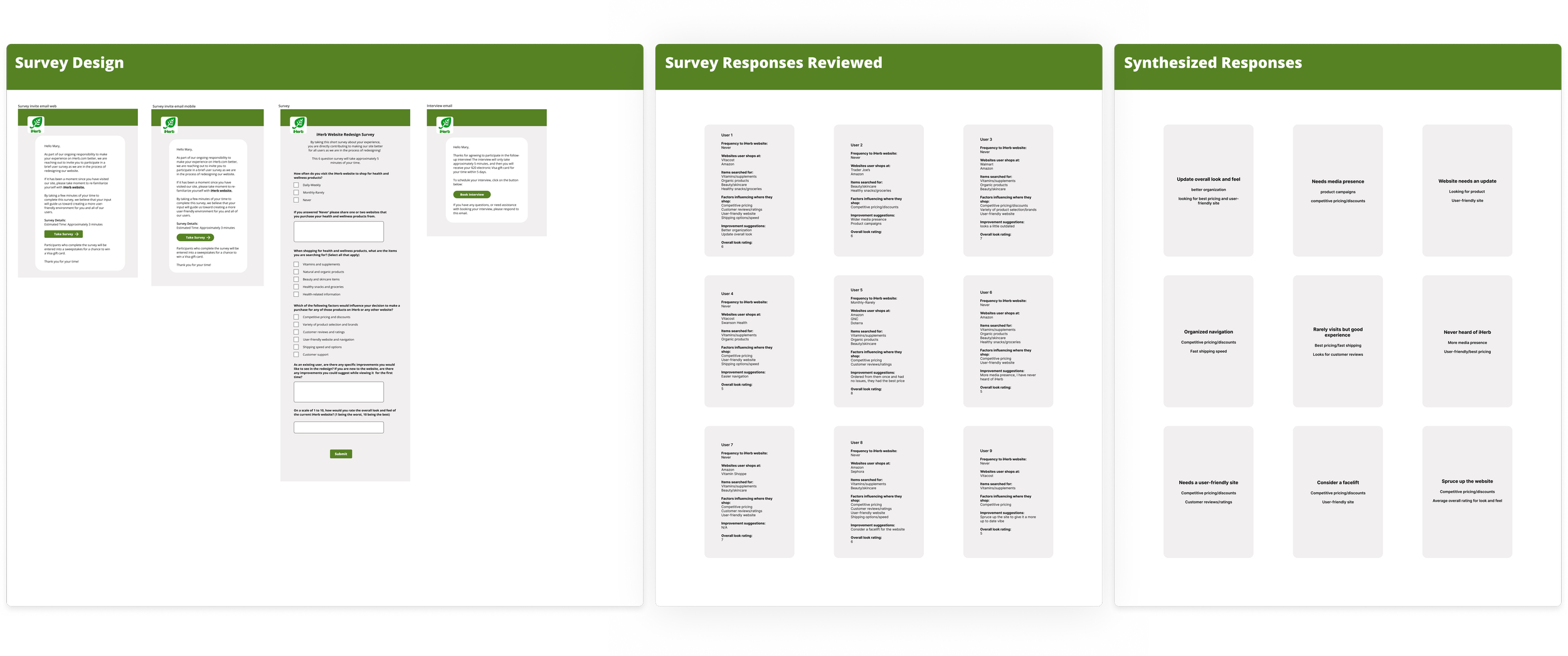
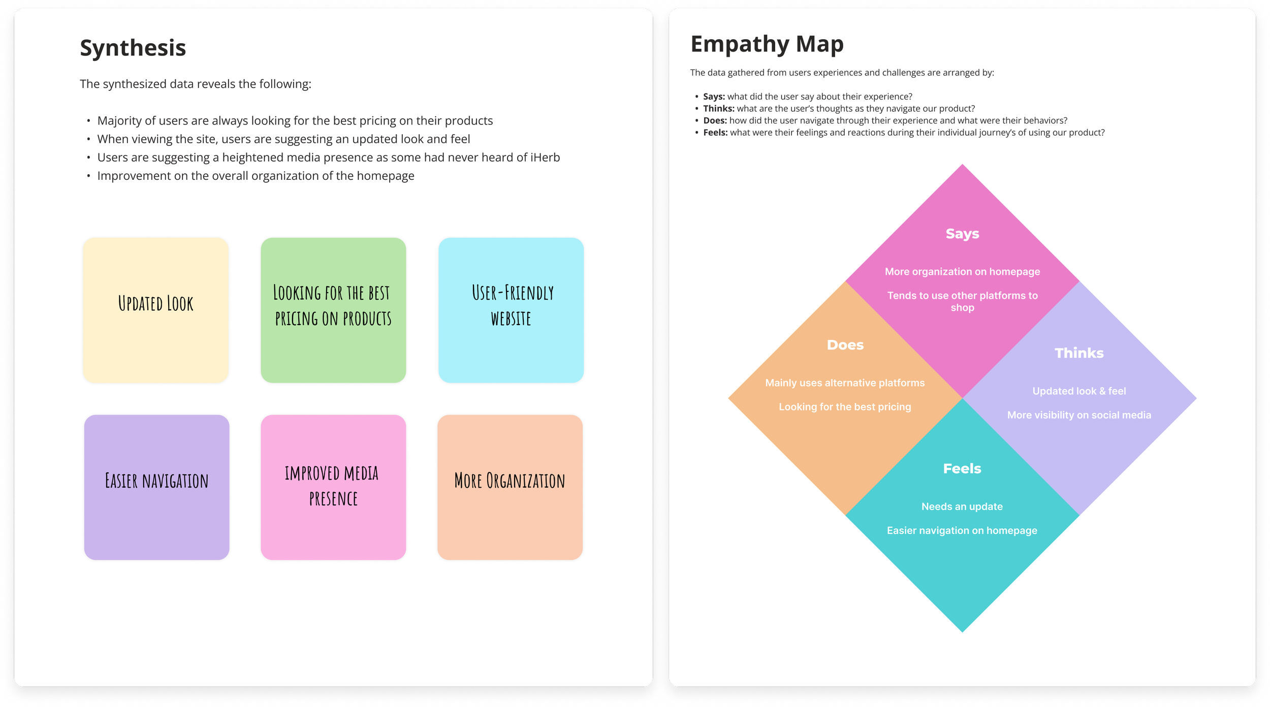
Qualitative
This research was important providing valuable insights into human behaviors and attitudes. By conducting surveys, we gleaned insights from our target audience, which were then synthesized into empathy maps and user personas. This deep understanding of user needs and motivations guided our design decisions effectively.
What were the key takeaways?
A primary insight from user research indicates a strong desire among users for a modernized aesthetic and enhanced organization, prioritizing a more user-friendly experience on the website.
User research indicates that iHerb would greatly benefit from enhancing its media presence and launching more impactful product campaigns.
When shopping for their supplements customers prioritize competitive pricing, discounts, and expedited shipping options.
Customer reviews are significant in informing purchasing decisions, highlighting their paramount importance to users during their shopping journey.

User Personas
Two distinct user personas were constructed, each capturing the rich tapestry of characteristics and behaviors within our target audience. This tailored approach fosters a more personalized and empathetic design process, resonating effectively with the diverse needs and preferences of our users.


User Experience Design
User experience design involves crafting digital products, services, and environments with a deep understanding of user needs, behaviors, and preferences to ensure seamless and meaningful interactions.
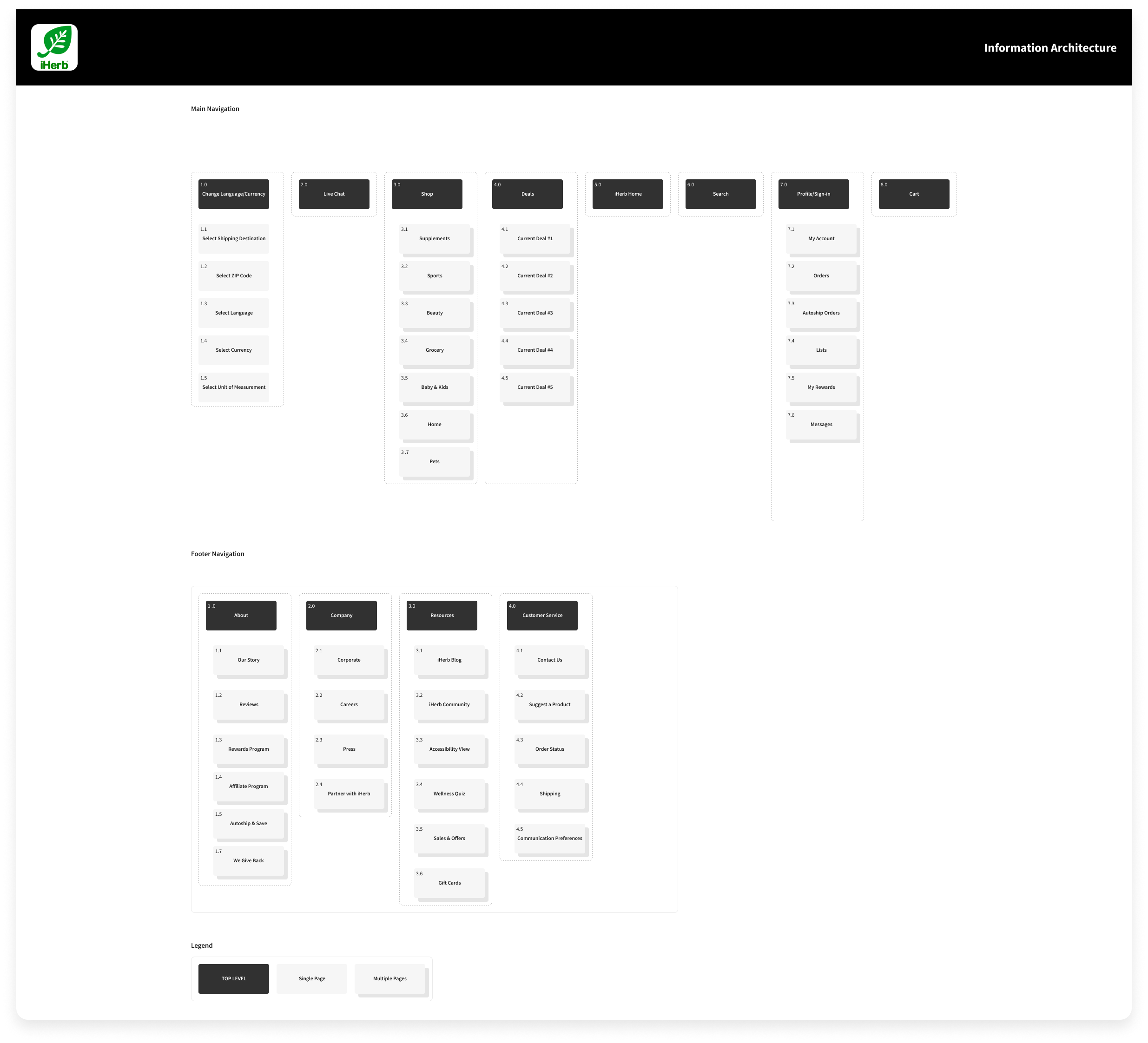
Information Architecture
I created a navigational blueprint showcasing the revamped menu structure, prioritizing improved navigation for the iHerb website redesign.
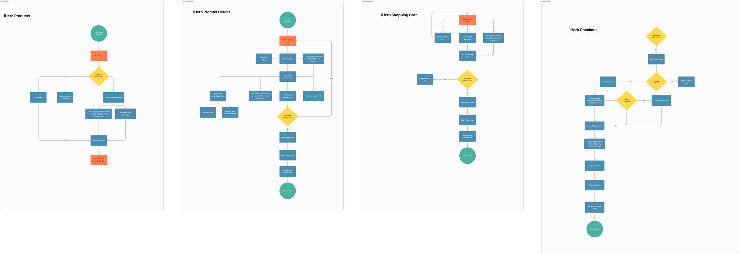
User Flow
User pathways were mapped out for various pages to optimize the efficiency of the user journey, ensuring a seamless navigation experience throughout the iHerb website.
Sketches
Basic sketches were utilized across mobile and web interfaces to promptly conceptualize and refine ideas, prioritizing the development of the product's fundamental framework during the iHerb website redesign process.
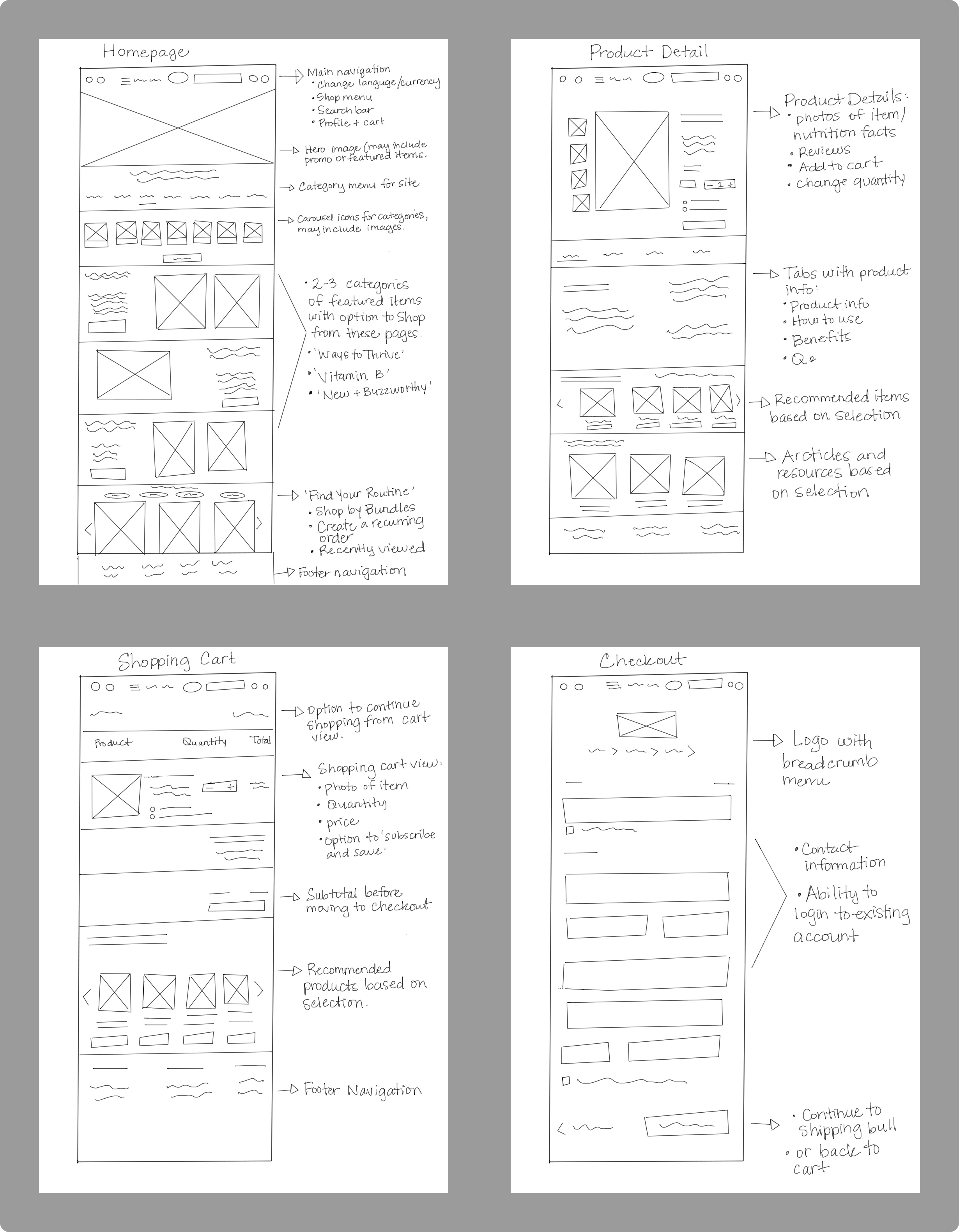
Wireframes
I developed wireframes allowing for a comprehensive visualization of the application's layout on both mobile and desktop interfaces. By stripping away color schemes, typography, and imagery, the focus remained solely on structural elements, ensuring clarity and precision in the design process.
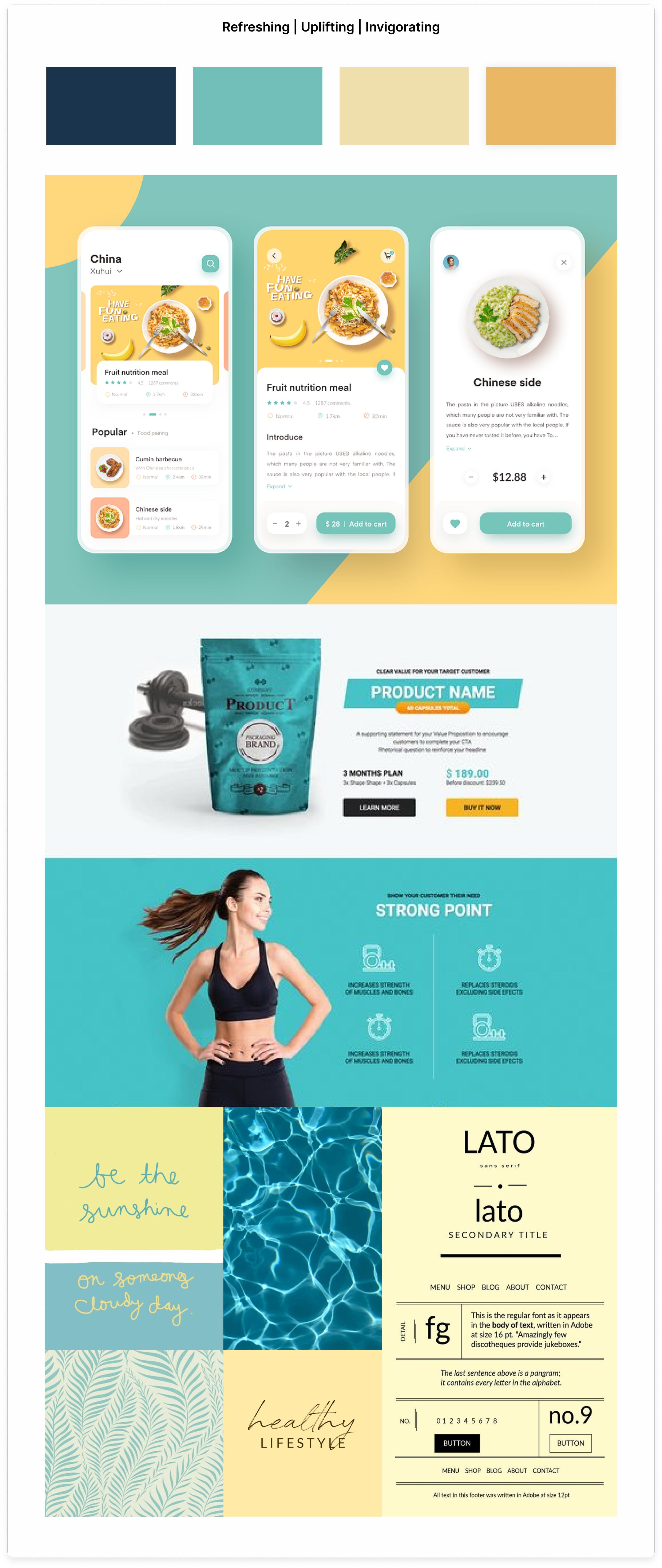
Moodboards
User Interface Design
I assembled mood boards to delve into a spectrum of color palettes, harmonizing with the essence of the brand and rejuvenating its visual appeal. My research traversed through multiple e-commerce websites, unveiling prevalent color schemes prevalent across the digital domain


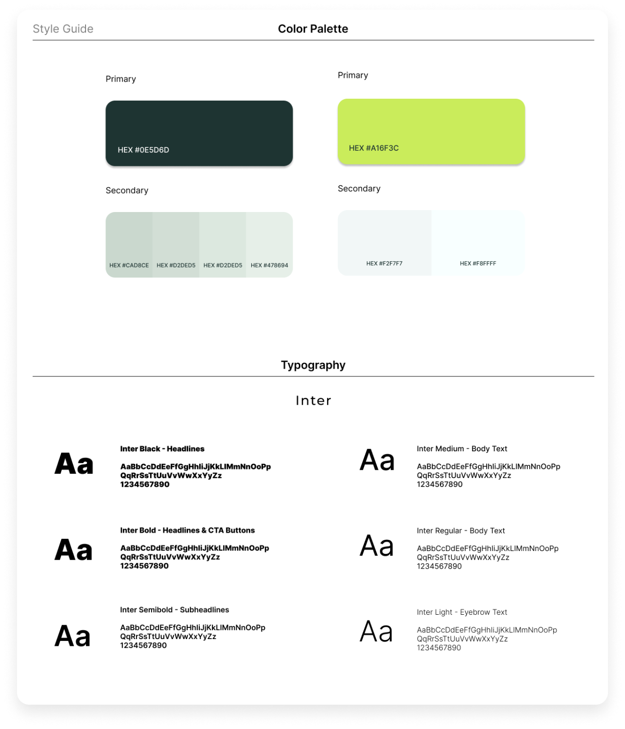
Style Guide
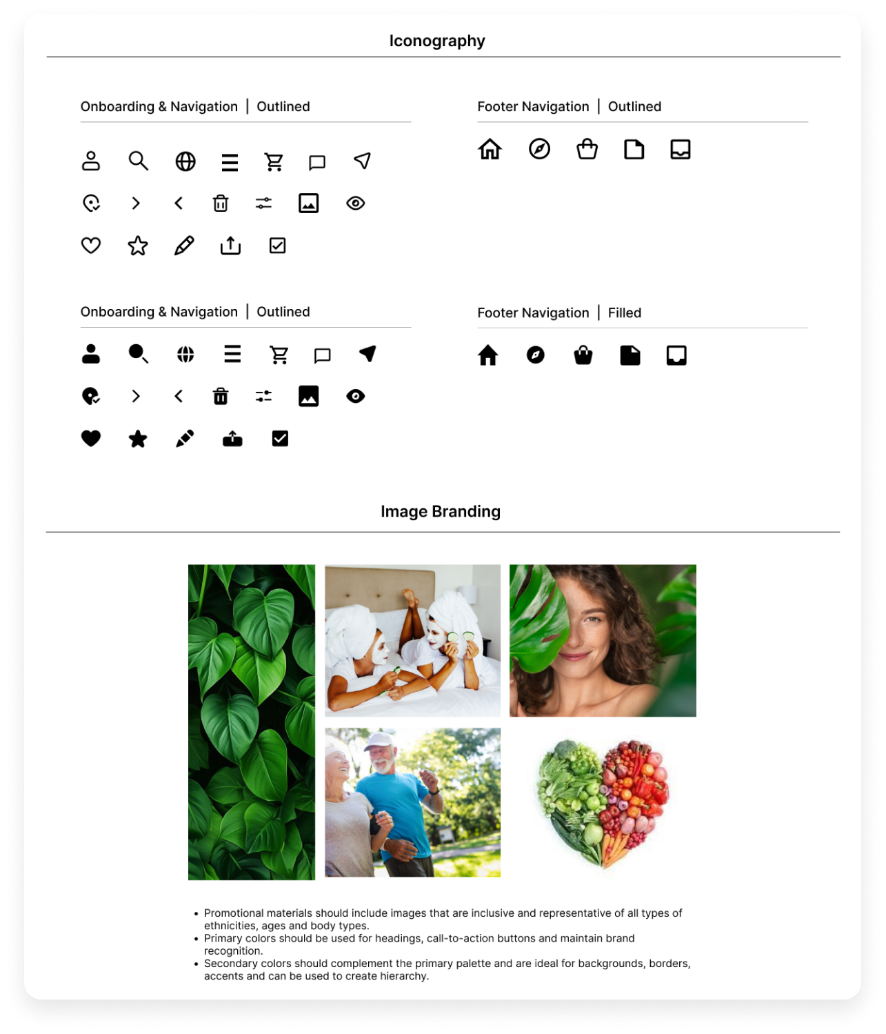
A comprehensive style guide was created that outlines the visual elements and design specifications used to maintain consistency across all brand communications of Dr. Tiplea’s website. It serves as a reference tool for ensuring cohesion in branding elements such as typography, color palette, imagery, and logo usage.
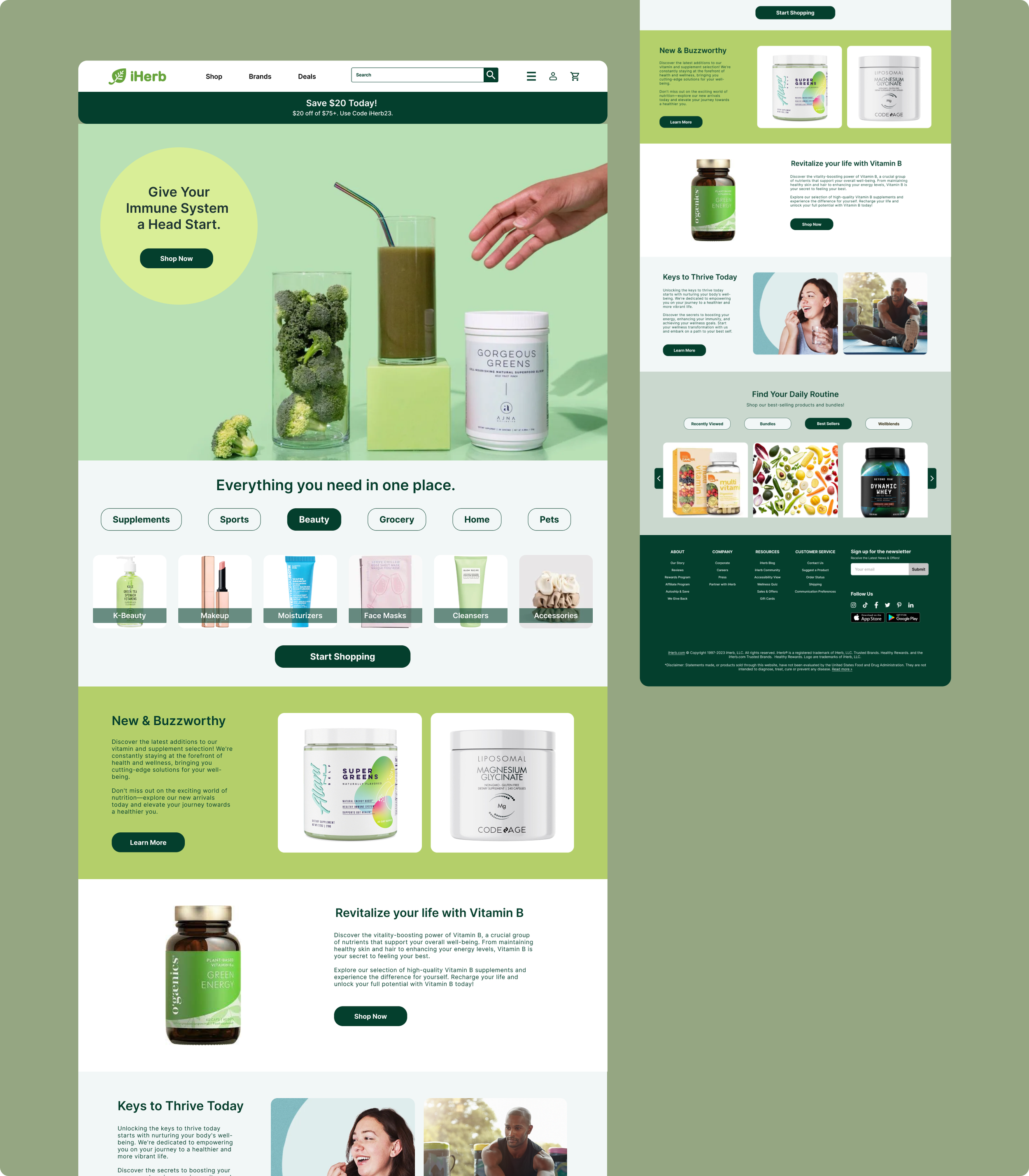
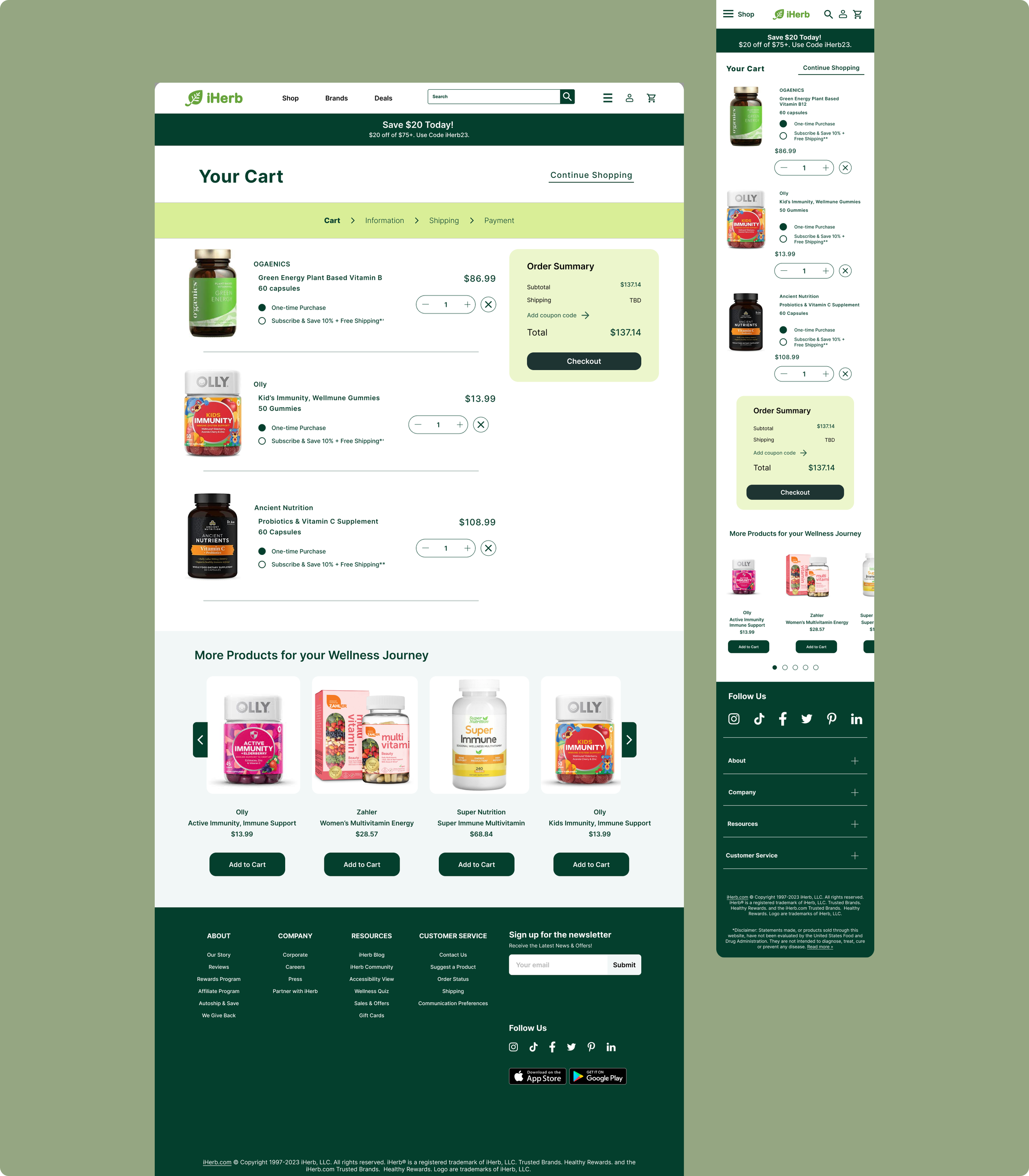
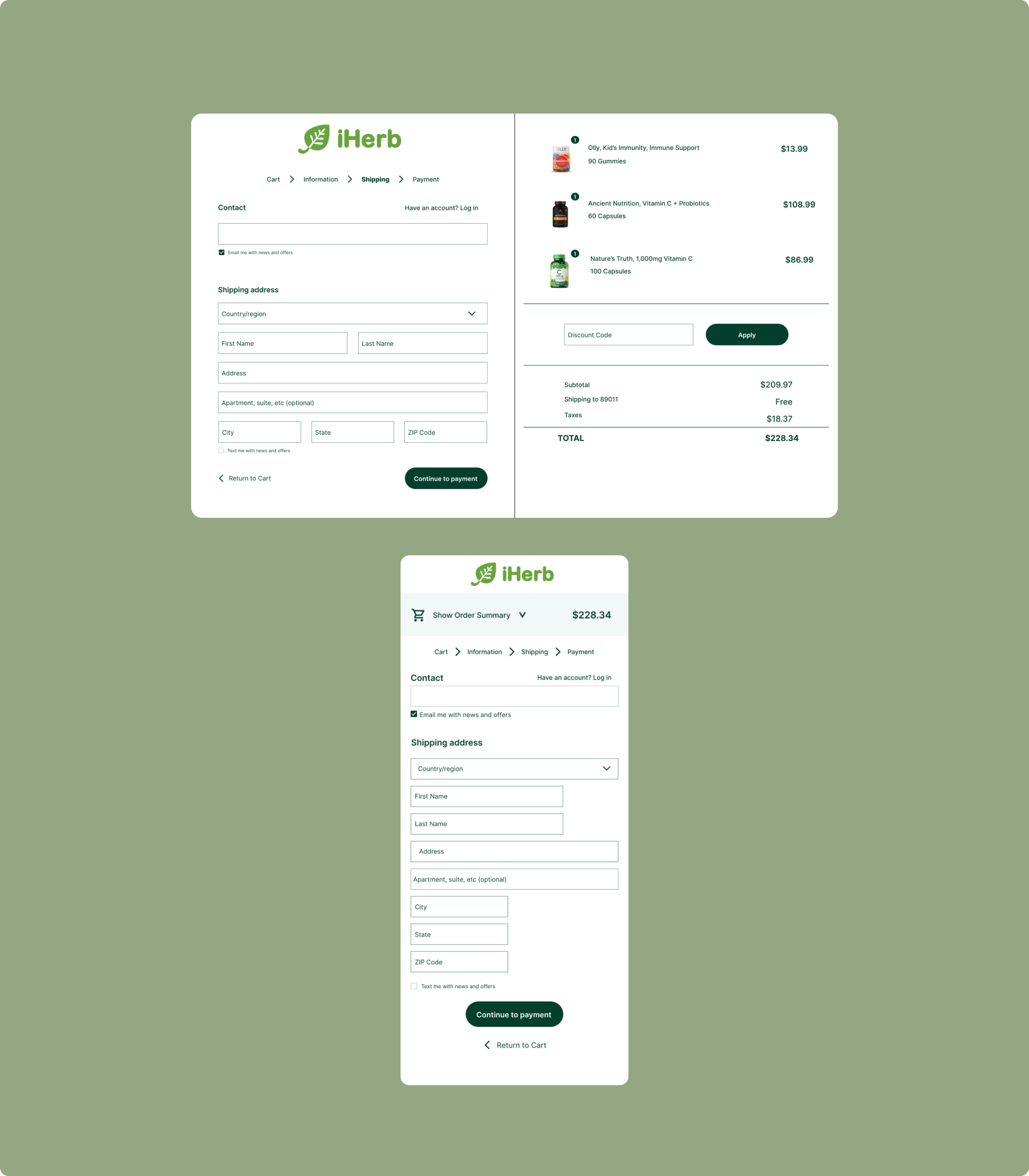
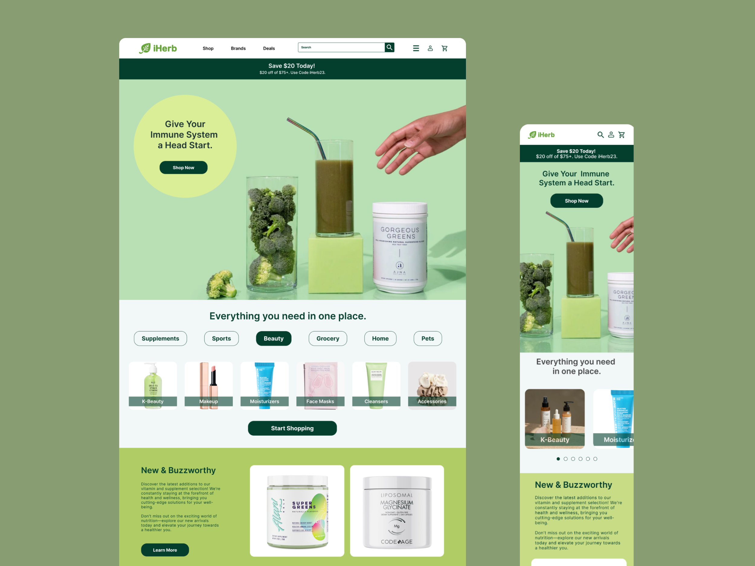
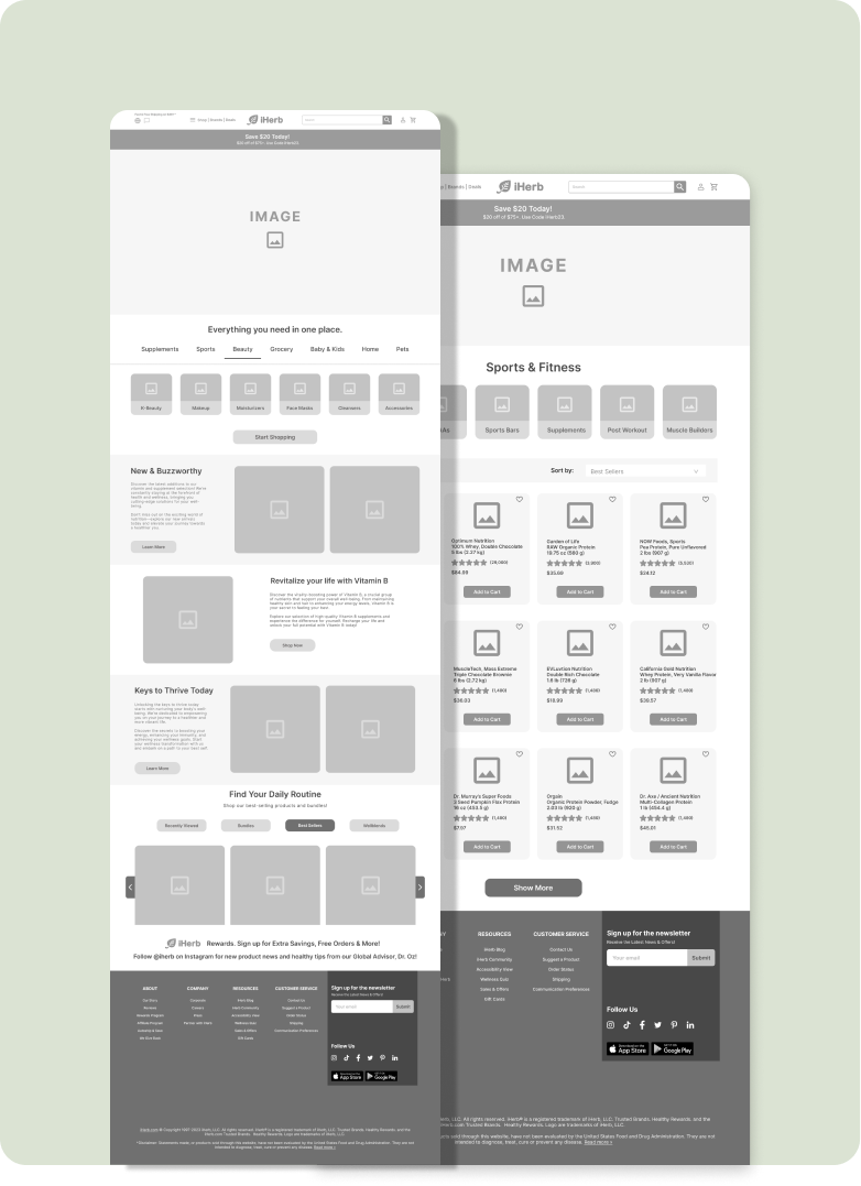
Final Product
During the final stage, the initial wireframe designs evolved, integrating valuable feedback, and a carefully curated color palette was selected. The final iteration of the product was crafted with paramount regard for its users' needs and preferences.